Companies are constantly talking about ways to manage and create positive consumer relationships. For digital companies, many times a relationship is formed the first time users visit a brand’s website. If users have a good experience, they start to form a positive relationship with the brand; if they have a negative experience, they form a negative relationship- or none at all. Because experiences and interactions are incredibly important in creating a consumer relationship, it is imperative that the first impression and interaction with a website be good.
This post will take you through 5 accessibility mishaps that give website users poor impressions, and how to avoid these mishaps to ensure a positive brand and site user and consumer relationship.
1. “I Need Space”
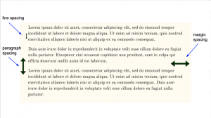
 Online accessibility is all about creating a website that can be used by everyone. One of the easiest things website managers can do to make a website accessible is to make web content – especially text- approachable, and easy to comprehend. This can be done by leveraging paragraphs and spacing.
For text, watch for too much material on a page which can be distracting, especially to people with cognitive disabilities such as ADHD or autism. Also pay attention to the space between paragraphs. For best practices, webpages should include white space between content, line spacing should make up 120-160% of text size, and paragraph spacing should be roughly equal to body text size. Text should also be broken into paragraphs, and not left as one large chunk of content.
2. “You’re Just Not My Type”
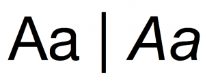
 Spacing is not the only important part of text- type is too! A study on the readability of type by participants with Dyslexia found that a higher readability score was given to Helvetica over Arial Italicized. While you or I may not notice a difference in the readability of the fonts, it doesn’t mean everyone shares our perceptions.
In addition to type family, type size is also an important factor in online accessibility. For font size, sticking with the default ‘100%’ is generally a good starting point for body copy; this is equivalent to 16px in desktop browsers, and will generally yield a good readable text size on smaller devices. Don’t be shy about making the text even larger on bigger screens that may be viewed from a greater distance; it is important to make sure that your text is not only large enough to read on a screen, but also large enough to be read on any screen.
3. “I Think We Should Keep Our Options Open”
According to the CDC, more than 15% of American adults have auditory problems, and nearly 10% have trouble with vision. This means that anywhere between 15% and 25% of Americans alone may be struggling with accessing a website if it doesn’t offer accessibility options for people with specific vision or auditory needs.
Closed captions and screen zoom enabling are good ways to make your website more accessible. Just think: if your users can’t see your calls to action, how can they move forward with their user journey? If your users can’t hear your videos, how can they learn about what you’re saying? Even if users don’t struggle with hearing, lack of closed captions still may be a deal breaker for some site users. In fact, a UK study found that while only 18% of the population that used CC, 80% of those users were not “auditory impaired”. Don’t miss out on an opportunity to let your brand tell a story with video just because site users need to see it, not hear it.
4. “We’re Not In a Good Place”
 If you’re looking to get to a website’s homepage you’d look top left. If you’re looking for a website’s shopping cart, you’d expect it to be top right.
Nielsen’s famous “F” pattern study shows that websites are generally scanned on the tops and left sides of the page. Since the F pattern study, marketing and content teams have been keen to make the most of their website real estate- especially the top left corner. Because the top and left sides of a webpage are most accessible, the most user pertinent information and important calls to action should be located on the top and left sides of your web page (think: “subscribe here,” “buy tickets now,” and all that good stuff). This allows for website users to quickly find what they need, and for brands to give users a good experience.
Other generally used website element placements include a logo in the top left corner, a shopping bag or cart in the top right corner, a copyright mark and “contact us” link in the webpage footer, a homepage-linked-logo, and a search option in the website’s global navigation.
5. “I Feel I Just Can’t Read You”
Even when you think your website is at its most accessible, read through it and check it for readability and accessibility. Then read through and check it again. Then have a co-worker read through and check it for you as well. Whatever you do, make sure your site has been tried and reviewed!
Readability is a large part of a website’s accessibility; if a site can’t be read and understood, how can it be accessed, or share its call to actions? One way to check a site is to make sure that it can be read on different mediums with various screen sizes and resolutions (does font, spacing, and placement of text look ok from mobile to tablet to desktop?). To check the accessibility of a website through readability of text itself, you could even try a free online tool such as the one from Webpagefx. Ultimately though, however you decide to test your site, it is important for a website and web pages to be readable and accessible. Do your due diligence with reading through your site to test its accessibility so that you can cultivate positive customer and site user experiences and relationships.


