 On Wednesday, February 8th, AMA Boston members and guests gained valuable knowledge about data visualization techniques and applications in a webinar, “Art Meets Insight: Data Visualization Theory for Marketers.” The session was led by Paul Shapiro, the director of strategy and innovation at digital marketing leader Catalyst.
Chapter President Nirmal Parikh highlighted upcoming events for the audience and introduced Paul, who dove into a crisp presentation focused on what data visualization is and how we marketers can use it to make data more effective. The key takeaways were:
- “Using vision to think” includes tools such as charts, infographics, maps, and Tableau presentations.
- But – not all visual presentations are a good fit for data visualization, e.g. MRIs
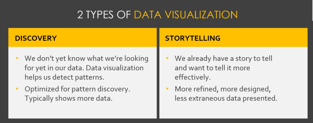
 Marketers are inundated with data, and visualization allows us to convey information better while also uncovering insights we may have missed.
- There are two types of data visualization: discovery and storytelling.
- Visual perception is very powerful, as the brain sees images faster than data, our recall of text is significantly increased when accompanied by images, and 60-65% of people are visual learners.
- Shneiderman’s Mantra offers many guidelines on designing visualization applications, including zoom and
.filter, details on demand, history and others. - Key types of data are: comparisons, relationships, distribution and composition.
- When you know the story you’re telling, there is a five-step process to create visualization, from defining the type of data to “making it beautiful.”
 Our subliminal perceptions are affected by attributes such as line length, width, size, colors and shapes.
- Influential statistician William Cleveland and Robert McGill did pioneering work on what makes charts more accurate, with attendees seeing few examples of what not to do!
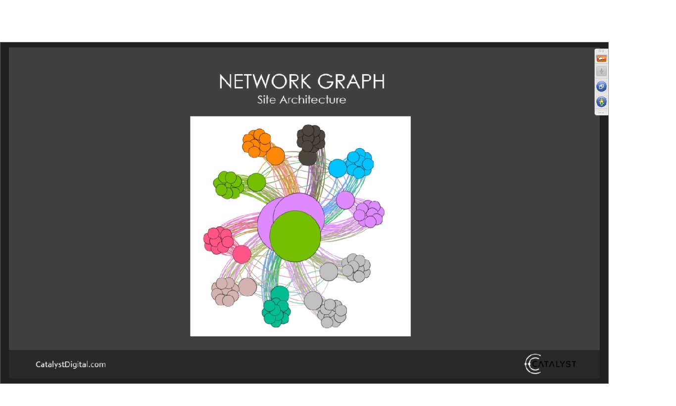
- Some interesting data presentations use Time Series, Venn diagrams, heat maps, network graphs (as at the top of the page), tree maps, word clouds and bubble charts.
- Paul concluded with several tips and rules-of-thumb, including subtle suggestions such as avoiding red and green due to color blindness (did you know 8% of men are affected?), and minimizing “chart junk.”
- A neat Q+A tidbit was references to tools such as Tableau software, free website www.datavizcatalogue.com and www.flowingdata.com.

After some interesting Q + A, Paul signed off, having left us with a deeper appreciation for data visualization and several psychological and practical suggestions to make your work resonate with your audience.
AMA Boston thanks Paul for offering more valuable marketing edification to our members, and to the attendees for their active participation! Check out our calendar for the many exciting events from AMA Boston and our partners!